Programming :: corownet
Updated logs page
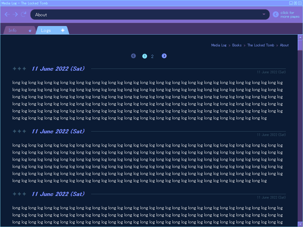
The updated logs page for projects. Even though I didn't think it was particularly stylish, I liked how cleanly the headers divided the entries, so I wanted to make sure the headers are very visible. It looks like I'm writing the date twice, but actually, logs can be titled...I just made the default the current date because I don't like thinking about titles. The fainter one on the right side is the real date.
I made the design resemble a web browser but placed the address bar above the tabs because it makes more sense in terms of page navigation hierarchy. I hope it doesn't look TOO weird this way - there are some things on my site that are janky like that, like how the guestbook page looks like a phone message log, but because it's scrolled to the top by default, the message order is...wrong. The breadcrumbs (which aren't links) show the order of nesting though, at least?